Polterguys CH3 28-35 CH4 1-8 are up and Cover Design Notes
- At June 02, 2012
- By Laur
- In processes, updates
 4
4

Click to read new pages.
Everyone, meet Clive! He’s kind of a party pooper, huh?
Cover Design
Thanks so much for all your input on the cover drafts I put up earlier this week, guys! I read and appreciated them all!
Here’s the story behind this troublesome cover. I started designing compositions for it just to get a feel of what I’ll be putting down on the page. Because I’m notoriously impatient when it comes to my projects (just ask N he knows the story), I skipped the entire step where you actually stop and think about what you’re supposed to be designing.
The B cover which everyone was gravitating towards was my favorite, too. After some back and forth edits with my sister strengthening the composition, we came up with something that eventually looked like this.
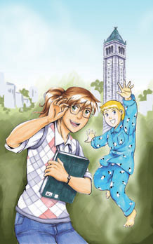
I realized that I instinctively pose my characters in happy, excited poses and man, was it completely wrong for this cover. That’s a digital mockup for the background and it just wasn’t reading right for me. Yeah, the feedback I got from the compositions I put up was there but somehow I just needed to see how wrong it was before I could move on and entertain better ideas. XD Sorry, guys. I’m pretty stubborn in some ways.
So, N and I sat down and tried to come up with the elements we wanted represented for this cover.
- It has to be simple and graphic. I can’t have all the ghosts in it even if it’s a “harem story.” If you actually look at Fruits Basket and Ouran’s Covers they are quite simple. (Too simple that it might offend artistic sensibilities. I love Yusuke Murata’s fantastic covers for Eyeshield 21 but if you stop and consider which illustration reads better on a 200x tall thumbnail – the simpler, less convoluted compositions win out.
- It has to have elements of urban fantasy. In my case, something that signals more of a mystery vibe. Something intriguing. This is totally not present in the version above which feels like a happy shojo adventure.
- It’s got to be “dramatic” for lack of a better term. I wanted something to pop at me. Something I won’t be embarrassed to share all over the web and something I’d be proud to sell in person. Tall order, I know.
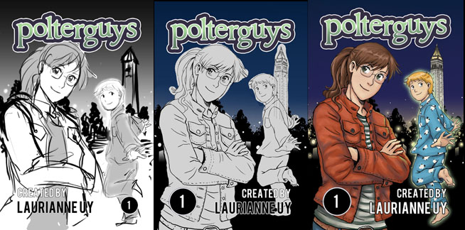
These were the first few approaches with the new direction. I even have more mockups with a more Nancy Drew feel as one of you suggested. I love Nancy Drew’s scenario covers but I knew it was definitely something I just wanted to illustrate on the side and won’t be as strong as cover material.
So it wasn’t until I found beautiful images of Sather Tower lit up at night that I was able to come up with the thumbnail above and figure out the treatment for the background. The black backdrop is a dramatic contrast to the color in front. The nighttime setting and Simon’s faint glow (and you know the big ole’ ghostly sign) is hopefully enough to signal the book as urban fantasy. And finally, it’s very simple and reads well even when I’m 15 feet away from my monitor.
So yeah, here’s what I have so far and will continue to work on. 😀
Oh wow, that’s a lot of words. I just wanted to share my process for this really tricky cover and I hope you might find it useful. It took a while to get it right and yes, there was a lot of frustration and anxiety involved. I was honestly very worried I wouldn’t come up with something I’d be happy with in time. Deadlines are pretty scary. Definitely take some time, save yourself the heartache and actually verbalize what you need from the project. Sometimes, assumptions can lead you astray!
More exciting stuff to come soon, guys. 😀


