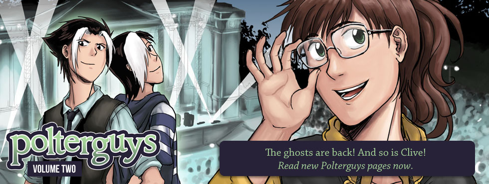


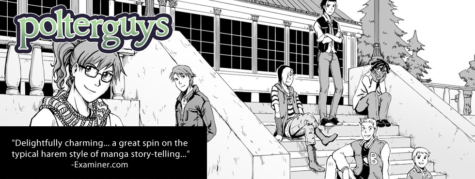
Circle Composition Challenge
- At March 15, 2011
- By Laur
- In blog, processes
 0
0
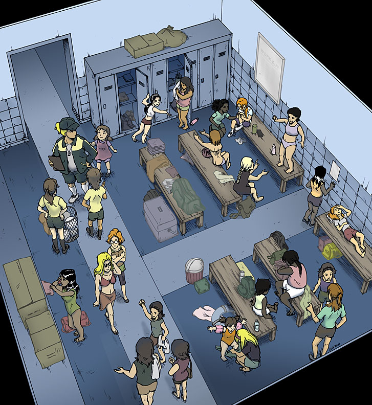
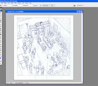
Updated the original illustration gallery with the image above. This is actually (believe it or not) a self-imposed portfolio entry with a focus on circular composition that somehow morphed into an exercise tackling perspective and crowd scenes, too. It’s been a fairly interesting process for me (mostly because I had no idea what I was doing) so I just wanted to share some insights. Basically, I attempted to do it one way, realized mistakes down the line, took steps to correct it and finished with something that is hopefully not too shabby to look at.
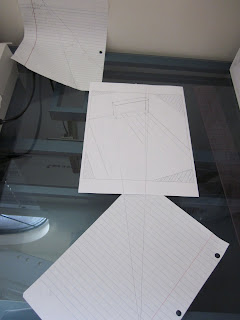
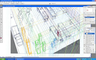
This was the physical set-up as I laid down the perspective on the Y and X axis. (Axis-es? Axes? XD) You’ll note that I’m actually missing the third one receding on the far right. I thought I didn’t have to deal with that but as my beloved sister pointed out to me: “Dude, don’t cheat.”
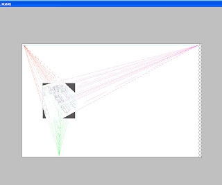
This was my set-up in photoshop to fix perspective issues. Despite it’s intimidating nature, this was actually pretty easy and straightforward to work with. I just created a layer that had the horizon line, mapped the first vanishing point on it and estimated where most of the lines I drew up were receding to on the left. From there, any line I drew on that axis should head to the vanishing point. I admit it gets a little tedious and there’s always that automatic vanishing point feature on Mangastudio I could use but I guess I wanted to do it on my own first and understand it a little better. After all, you can’t understand the mechanics of more advanced tool if you don’t get the basics first.
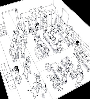
I had some ideas where people would go and what they would be doing but drastically needed to fix how they were standing or sitting according to their positions in the room. As my sister so patiently pointed out, you should only be able to see mostly just heads and shoulders of people in the lower left corner. In my sketch, they look like they’re sliding down the room. There were also some problematic size differences which could be fixed by determining how tall people were in respect to the room.
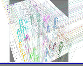
So to fix perspective and height differences, I mapped people along the room using blocks with edges that recede to (you-guessed-it) the vanishing points. This was probably the most obsessive compulsive step in the entire process and I don’t really recommend doing this for your first time with an entire room full of people. (I’m afraid some of you might just give up on perspective altogether from such a harrowing experience.)
Here’s a close-up of the process with some of the layers removed. I did layers based on groups of girls in the room so all those lines wouldn’t drive me crazy. So, blocking not only helped me fix the perspective issues, the process of doing so also made me fix the size discrepancies.
Next, I penciled the corrections digitally and printed it out to ink. Honestly, with so many hours spent staring at the computer fixing little things, getting to work on my art table and using actual tools is a welcome break. I’ve started using this trick to blow the sketches up for print so I could ink and scan it in a higher resolution. So while I sketched this on an 8.5×11 sheet, the final inked piece was on a B4-sized Deleter Comic Book sheet. I can’t quite tell how much of a difference it makes with the final work but I just know bigger is usually better. (but isn’t it always? *drowns in a hail of rotten veggies*)
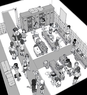
Finally, I did a value study of the image to determine how I was going to color everything in. Having never done this part before, I can’t say how well I managed to accomplish the intended goal: which was to draw attention to the circular composition of the figures in the room. Apparently, the negative areas being lighter and barer than the darker, more detailed figures, naturally draws the eye in. So I ended up reversing this scheme to come up with the final picture above.
Regarding color, Tony Cliff has a wonderful series of posts on the lessons he learned while working on his next Flight entry. They were quite useful for me as I fudged around coloring with the gamut tool for the first time. If nothing else, at least the I didn’t end up putting down all the bloody colors of the rainbow as I used to mercilessly.
Overall, the piece could use a lot more tweaking but I need to distance myself for a while to work on other priorities. Thanks for reading this massive post, guys! Questions? Comments? Feel free to hit me up here, twitter or DA.
Comicking Part 3: Character Designs
- At March 11, 2011
- By Laur
- In blog, processes
- 4
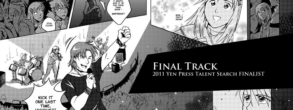
This is Part 3 of a series of posts I’m writing about how I made Final Track, a 34-page shojo manga I worked on as my submission for the Yen Press New Talent Search.

Virtual shopping for wardrobe
The next part of the process is a little bit like the preparation people need to do before filming a movie. Much of it involves research, gathering references and choosing the visuals that will be appearing in your story. And it doesn’t necessarily have to come after parts 1 (generating ideas) and 2 (writing and thumbnailing) either. For this particular project, I had some ideas how my characters were going to look like but prioritized getting the story right first.
Character Designs
I refer you all to a wonderful series of posts Aaron Diaz wrote up on figure design, costume and silhouette. There’s plenty there to digest and I certainly can’t say I’ve mastered all these basic concepts myself.
For Final Track, I wanted the personalities of the main characters to clash. One of the easiest ways to do this was to convey their differences through what they wear. I wanted the male lead Drake to be loud and confident so his design had to be somewhat vibrant with lots of great angles like spiky hair, and a faux fur-trimmed jacket. In contrast, the female lead Jen was smaller, had smoother lines and less of a flamboyant style (basically boring XD).
I like to keep my character designs simple and streamlined. If I have to draw details, I try to make them manageable. You are after all drawing them over and over again. Having a bajillion details on your character’s epic armor is just a recipe for disaster. If you don’t have assistants and you’re on a tight deadline, KEEP IT SIMPLE!
It’s also a good idea to have some kind of model sheet which you can consult as you work on the comic. It’s very easy to get “off-model” especially if you’re drawing your characters with varied expressions and from different angles.

Jen's costume changes throughout the story
Here I just sketched out Jen’s wardrobe throughout the comic. Sometimes it’s nice to externalize the change or growth of your character visually, as opposed to spelling it out via dialogue (I heard Hitchcock used to do this in his films).

Helpful aid during production
This was a pretty useful thing to have when you design complicated accessories for characters. You could easily forget a ring or necklace somewhere.
As always, it’s best to have other people give you feedback on your designs to help you discover things you may have overlooked.
Questions? Suggestions? I’d love to hear from you!
Previous Post: Comicking Part 2: Writing/Thumbs
Next Post: Comicking Part 4: Pencils, Bubbles and Inks
Comicking Part 2: Writing and Thumbnails
- At March 01, 2011
- By Laur
- In blog, processes
- 5
This is Part 2 of a series of posts I’m writing about how I made Final Track, a 34-page shojo manga I worked on as my submission for the Yen Press New Talent Search.

Creative Chaos
Now that you’ve got some ideas, it’s time to choose one and focus on crafting it. I’m going to be honest with you and admit this is the most difficult part of the process for me. You’ve really got to be patient during this process because if you care about creating an interesting, meaningful story, it comes with a price: dedication, perseverance and time.
Ever since I was introduced to the craft of screenwriting (writing for TV and movies) by my writing partner (@nathango), I started paying more attention to elements of stories I previously used to gloss over. I started running into terms like character motivations, conflicts and resolutions and felt like I was learning vital notions I could use in creating comics. I’m sure there are plenty of great books for how to write comics, too, but I’ve been in love with movies longer than I’ve been reading comics so it was just a matter of preference.
It certainly helps to have someone with you through the brainstorming period in which your story takes shape. I’ve worked with Nathan, my co-writer on Final Track, on projects before and I know we care enough about creating a good story that we can get into lengthy debates over important things. We talk about characters first and what their journey will be like. Then, one of us makes a rough outline of how we think things will go. Once we get to this stage, I take over and make my first pass at dialogue.
Scripting
When I script, I just use MS Word and change the layout orientation to landscape and create two columns per page. Recently, I’ve also tried just having the page view showing 2 pages simultaneously. The Insert>PageBreak function is especially useful when I want to write for a new page. I do this to get a feel for where the page I’m writing falls: right or left. (In this case, my assumption is based on a printed comic book layout.) That way I can plan important scenes like surprises on a left page so you don’t see it coming until you turn the page. I also have an easier time figuring out where I can insert a double page spread to make sure it actually takes up facing pages.

Landscape mode in MS Word
If I have a page count limit, I find it helpful to break the story into chunks and determine how many pages each chunk should take up. If you know about act breaks, you can break your story into however many acts you want (for example, the typical number of acts are 3 for a movie — this is easy to understand: beginning, middle and end). This way, you know what scenes should be extended or cut depending on page availability.
I have a lot of fun with dialogue and enjoy writing for comedy. It’s when I script and play with the characters’ voices in my head that I see the comic come to life. But sometimes, I can get carried away with ideas. So getting feedback as early as this part in the process helps me avoid making painful changes down the road when things are harder to edit. Having a working script doesn’t make things final anyway. Often, I create thumbnails alongside the script especially if I want to see how scenes break down on a page. This helps me include visual notes that I don’t have to write out on the script.
Thumbnailing

Squiggles and boxes

With thumbs, I’ve been wavering back and forth with drawing them on paper and using a tablet on Photoshop. Thumbs don’t really need to be polished which is why I can do them on scrap pieces of paper. But when I’m moving scenes around different pages, having the option of cutting and pasting panels and sequences onto new pages frees me up creatively so I don’t have to erase and redraw anything. I can concentrate on the flow of the story.
Flow is really what I pay attention to when I’m working on thumbs. Does it make sense? Are the elements on the page properly guiding the reader? What are the most important aspects I want to highlight in the scene? All of these are questions I ask when drawing the stick figures in the boxes because I want to control the experience of the viewer and make them see what I want them to show them. If you don’t understand what’s going on in a panel of a comic page, it’s likely the result of poor composition choices.
Questions? Suggestions? I’d love to hear from you!
Previous Post: Comicking Part 1: Ideas
Next Post: Comicking Part 3: Character Designs
Voltron 101 in Voltron: United and Drawn
- At February 12, 2011
- By Laur
- In blog, updates
- 1

The Voltron books arrived and they’re very shiny! My piece “Voltron 101” is on page 138. Check it out at the Voltron Webstore!
The following are some of my favorite illustrations in the book and really stand out for me.
– Sean Moore’s DOOM Propaganda Poster-esque illustration is fun.
– Brent Schoonover’s inspired vintage comic book cover ala Jack Kirby is just wonderful.
– Andrew Griffith’s piece is a very cool what-if scenario with Voltron as a kind of Steampunk Viking warrior.
– Dave Perillo’s adorable retro portraits of the Lion Force team
– Fernando Peniche Vargas’s illustration of BOTH Lion and Vehicle Force Voltrons is not only inclusive but also super dynamic!
– Michael Borkowski’s depiction of Voltron vs a Robeast is pretty kickass.
I recently participated in February 1’s Hourly Comics Day. You can read how my day went on my blog here.
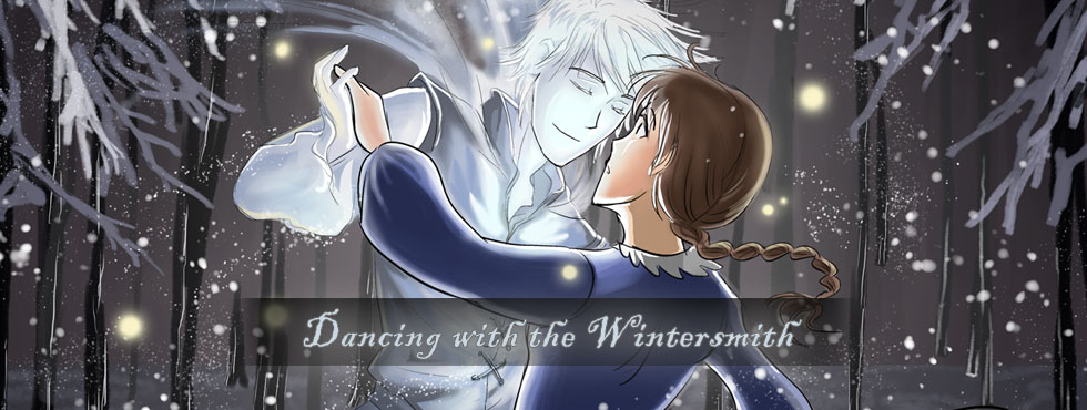
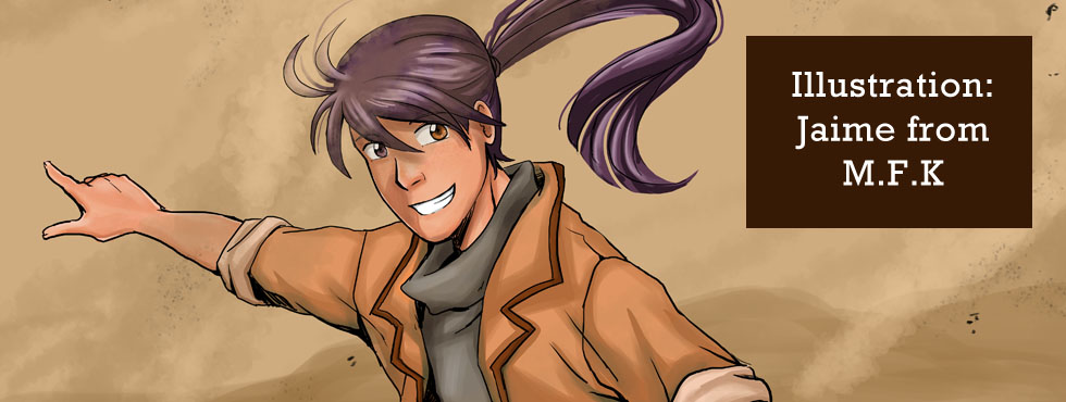
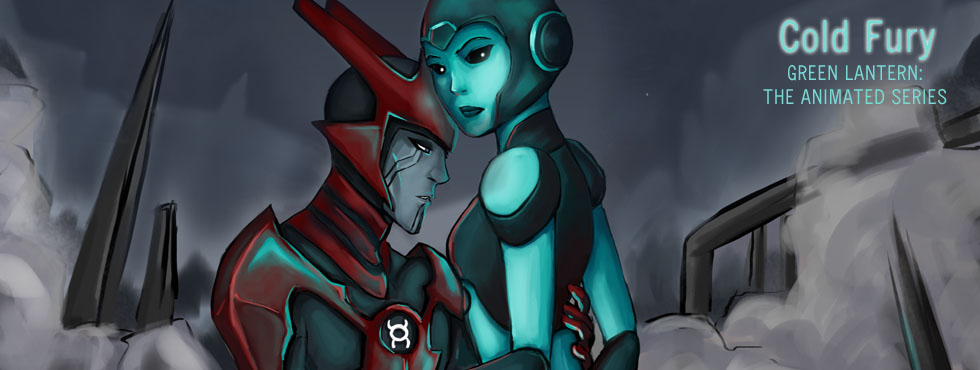
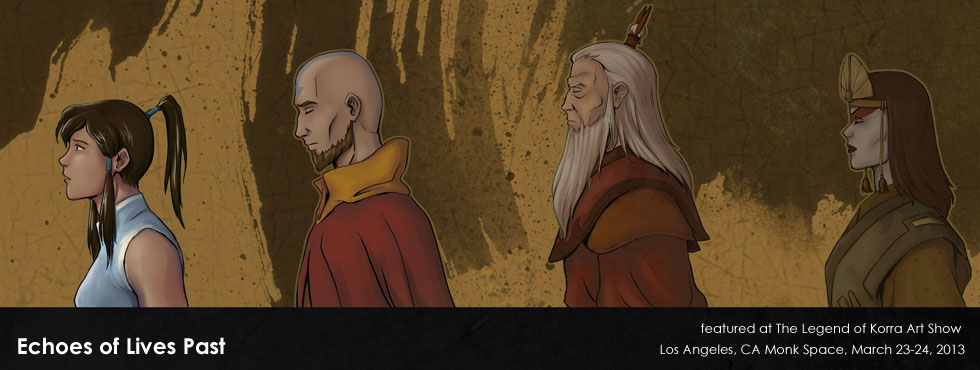
Also, uploaded a few new pieces to the illustration galleries.
3 Pages in Original Comics – Can’t seem to get them to show up properly so you can read them full-size here instead.
1 Original
2 Fanart