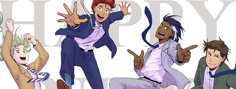
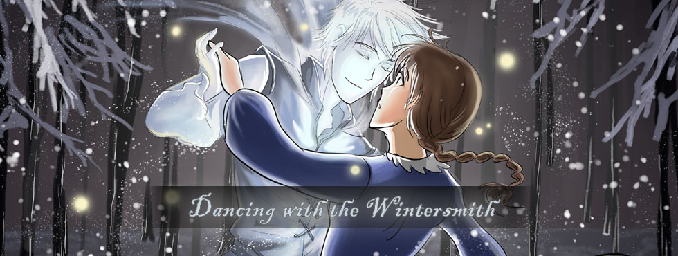

Nibs
- At April 21, 2011
- By Laur
- In blog, processes
 0
0

Deleter nibs and ink
I bought a couple of things at Kinokuniya this weekend on a sort-of whim. I knew I wanted to keep experimenting with nibs but I already had a School G Pen and some Maru nibs. So far, they’ve been ok to use with the ink I had lying around. The School G skips on me sometimes but I think I effed it up one time when I didn’t use it for months. I didn’t have a sizable pen holder though so I splurged for the $12 to get the kit and some good ink and BOY oh, BOY am I glad I did~!

Re-inking a drawing
Wonky anatomy aside, I’ve been inking using both the Maru and G nibs on a few other pieces lying around (like Erza) and I’m absolutely digging the results. They look so different from the multiliner lines, it’s bananas. The quality also looks more confident despite my actual LACK of confidence putting down those lines HAHAHA. I really can’t wait to try these guys out on the comic pages I’m working on right now.
Comicking Part 5: Manga Studio and Etc.
- At April 11, 2011
- By Laur
- In blog, processes
- 5
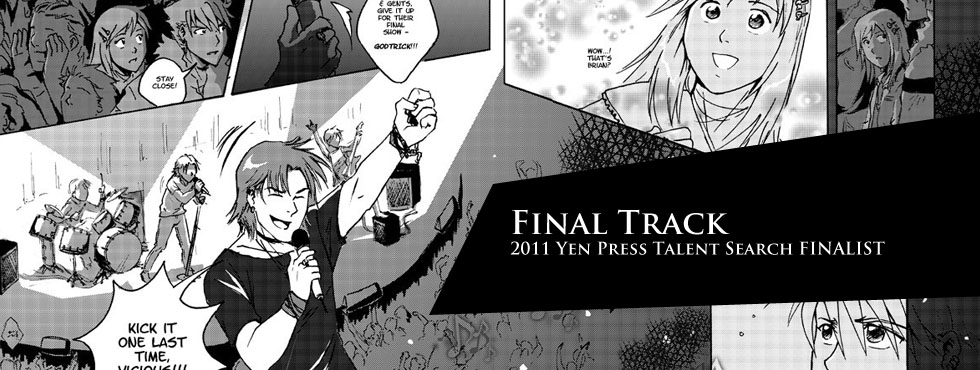
This is Part 5 of a series of posts I’m writing about how I made Final Track, a 34-page shojo manga I worked on as my submission for the Yen Press New Talent Search.

Toning on Manga Studio
I usually ink all the pages completely before scanning everything. I know some people like completing one page at a time and that’s fine. We all have different preferences. I scanned these pages in at 600dpi even though 300dpi is the usual standard for printing. Unless your computer can handle the file size, I’d say 300 is fine. I save them as Bitmap files (.BMPs) and import them in Manga Studio.
Using Manga Studio seems to have been fairly intuitive enough that I managed to plow my way through after looking up processes and figuring out what commands did what. Suffice it to say that I’m much happier with the results from Manga Studio than trying to tone in Photoshop. The database of built-in tones by itself was a lifesaver and the ability to use gradient tones made achieving certain effects efficiently.

Print Drafts
If you’re doing a comic specifically for print, it’s important that you actually see what it looks like on physical paper. You’re likely to discover things that jump out at you very differently from viewing on a screen. I’m always fortunate to have a very patient and detail-oriented sister willing to go over my work with a fine-toothed comb and point out areas for improvement. Afterwards, ofcourse, the next step involves implementing the feedback. It’s only after I’ve gone over everything again did I feel like the work was polished enough for presentation. It’s important to put your best foot forward.

Nov-Dec 2010 Schedule
If the process seems unwieldy and time-consuming, it really is and it will totally be your advantage to give yourself concrete and achievable deadlines. This will allow you to keep track of your progress and make adjustments to your schedule as needed. Final Track was a project I undertook for 2 months with full-time work. I did take a week off on Thanksgiving but the rest of the time, I spent working on it weeknights and weekends. I gave myself plenty of breaks so not to strain my body, ate well and slept regularly. No last minute rush jobs here because I hate doing that. Some people might be able to produce their best work under extreme pressure but I know I can’t. I’ve never been prone to pulling all-nighters because I just can’t recover from sleep debt as graciously as others can. So, I rely on strategies and planning ahead to make sure the work gets done.

Evolution of a page
Well, there you have it! This wraps up my behind-the-scenes look at Final Track and my comicking process. Hope y’all enjoyed!
Questions? Comments?
Previous Post: Comicking Part 4: Pencils, Bubbles & Inks
Final Track: Yen Press New Talent Search submission
- At March 29, 2011
- By Laur
- In blog, updates
- 5

Well, here it is! 2 months worth of blood, sweat and tears. In November last year, Yen Press announced a New Talent Search calling for original 32-page short stories. My writing partner Nathan and I collaborated on this story and I spent most of November through the New Year on the art. We’ll see in a few weeks what actually becomes of this story but for now, I’m sharing it with the world because boy am I proud of this sucker.
Unfortunately, the comic was made for print specs so I can’t do anything about the terrible moire patterns. If you have an easy way to get rid of them, I’d love to hear it but otherwise, I don’t think it’s feasible for me to re-tone everything for web.
Don’t forget to check out my blog posts if you’d like to know more about the processes involved in making this comic. Thank you for reading, hope you enjoy and do let us know what you think!
Comicking Part 4: Pencils, Bubbles & Inks
- At March 27, 2011
- By Laur
- In blog, processes
- 4
This is Part 4 of a series of posts I’m writing about how I made Final Track, a 34-page shojo manga I worked on as my submission for the Yen Press New Talent Search.

Messy but productive workspace
Using the thumbs I came up with, I started fleshing out my ideas on the computer using my Wacom tablet and Photoshop. I began drawing on the computer for this project because I knew I was going to ink by hand. Having digital files meant I could easily move panels around and make corrections faster than erasing and re-drawing line art. If it isn’t obvious by now, I take all the time-saving strategies I can get!

As before, I pay attention to the flow of the story and the dialogue and how a reader experiences the entire page. Sometimes, the squiggles in the thumbs process can’t really account well for bubble placement and I need to make a few tweaks. At this point, I’ve dropped the text into Photoshop from the script and create bubbles using the Pen Tool on another layer. I do this step digitally to make sure the text and bubbles work within the composition of the page. Nothing irks me more than pages with bubbles thrown in like a careless afterthought. These are important elements in comic pages and have to be treated with some dignity!

I had my first set of pencils reviewed then, made more changes and fleshed out backgrounds and details a bit more before printing it out for inking. Nowadays, I ink using my lightbox, an Artograph LightTracer Light Box. I have the 10×12 and this size suits me fine. Using a lightbox means I eliminate more pains associated with pencil erasure and torn paper.
I use both Copic Multiliners and Sakura Pigma Micron Pens
just because I’ve had them around for a while and I’d like to use them up. I’ve been experimenting a little w/ G-pens and Maru nibs but haven’t used them extensively for any project as of yet.
As for paper, I bought Borden Riley Paris 9 x 12 Bleedproof Paper at the suggestion of other webcomic artists. I like the thickness of the sheets and multiliner inks look great on it. I place a sheet right on top of my printed ‘pencils’, tape it down and ink borders, bubbles and the lineart directly. If there were any mistakes in my process, I’d say it was my reluctance to commit to stronger inks at this point. A lot of my inks felt weak so I had to redo them once they were scanned in.

Inking the double page spread
Inking was probably the fastest part of the process because I was way too reluctant to put anything down. I do think the lineart could have used more contrasts in general. However, given that this was “shojo” I didn’t want to lose light and delicate lines that are quite characteristic in the genre either. Hopefully, it reads as somewhat in between the extremes.
Questions? Suggestions? I’d love to hear from you!
Previous Post: Comicking Part 3: Character Designs
Next Post: Comicking Part 5: Mangastudio and Etc.