Circle Composition Challenge
- At March 15, 2011
- By Laur
- In blog, processes
 0
0
Updated the original illustration gallery with the image above. This is actually (believe it or not) a self-imposed portfolio entry with a focus on circular composition that somehow morphed into an exercise tackling perspective and crowd scenes, too. It’s been a fairly interesting process for me (mostly because I had no idea what I was doing) so I just wanted to share some insights. Basically, I attempted to do it one way, realized mistakes down the line, took steps to correct it and finished with something that is hopefully not too shabby to look at.
This was the physical set-up as I laid down the perspective on the Y and X axis. (Axis-es? Axes? XD) You’ll note that I’m actually missing the third one receding on the far right. I thought I didn’t have to deal with that but as my beloved sister pointed out to me: “Dude, don’t cheat.”
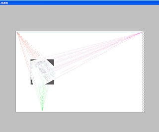
This was my set-up in photoshop to fix perspective issues. Despite it’s intimidating nature, this was actually pretty easy and straightforward to work with. I just created a layer that had the horizon line, mapped the first vanishing point on it and estimated where most of the lines I drew up were receding to on the left. From there, any line I drew on that axis should head to the vanishing point. I admit it gets a little tedious and there’s always that automatic vanishing point feature on Mangastudio I could use but I guess I wanted to do it on my own first and understand it a little better. After all, you can’t understand the mechanics of more advanced tool if you don’t get the basics first.
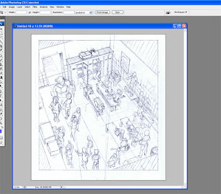
I had some ideas where people would go and what they would be doing but drastically needed to fix how they were standing or sitting according to their positions in the room. As my sister so patiently pointed out, you should only be able to see mostly just heads and shoulders of people in the lower left corner. In my sketch, they look like they’re sliding down the room. There were also some problematic size differences which could be fixed by determining how tall people were in respect to the room.
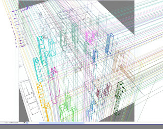
So to fix perspective and height differences, I mapped people along the room using blocks with edges that recede to (you-guessed-it) the vanishing points. This was probably the most obsessive compulsive step in the entire process and I don’t really recommend doing this for your first time with an entire room full of people. (I’m afraid some of you might just give up on perspective altogether from such a harrowing experience.)
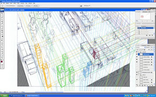
Here’s a close-up of the process with some of the layers removed. I did layers based on groups of girls in the room so all those lines wouldn’t drive me crazy. So, blocking not only helped me fix the perspective issues, the process of doing so also made me fix the size discrepancies.
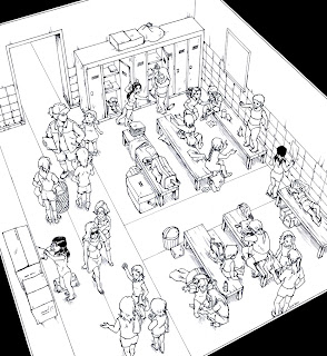
Next, I penciled the corrections digitally and printed it out to ink. Honestly, with so many hours spent staring at the computer fixing little things, getting to work on my art table and using actual tools is a welcome break. I’ve started using this trick to blow the sketches up for print so I could ink and scan it in a higher resolution. So while I sketched this on an 8.5×11 sheet, the final inked piece was on a B4-sized Deleter Comic Book sheet. I can’t quite tell how much of a difference it makes with the final work but I just know bigger is usually better. (but isn’t it always? *drowns in a hail of rotten veggies*)
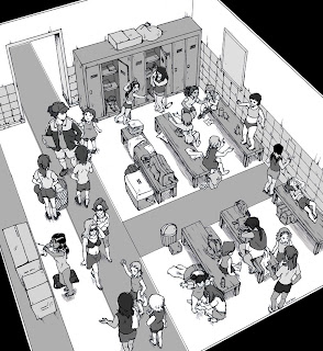
Finally, I did a value study of the image to determine how I was going to color everything in. Having never done this part before, I can’t say how well I managed to accomplish the intended goal: which was to draw attention to the circular composition of the figures in the room. Apparently, the negative areas being lighter and barer than the darker, more detailed figures, naturally draws the eye in. So I ended up reversing this scheme to come up with the final picture above.
Regarding color, Tony Cliff has a wonderful series of posts on the lessons he learned while working on his next Flight entry. They were quite useful for me as I fudged around coloring with the gamut tool for the first time. If nothing else, at least the I didn’t end up putting down all the bloody colors of the rainbow as I used to mercilessly.
Overall, the piece could use a lot more tweaking but I need to distance myself for a while to work on other priorities. Thanks for reading this massive post, guys! Questions? Comments? Feel free to hit me up here, twitter or DA.


